

15.11.11
17.10.11

13.10.11

3.9.11
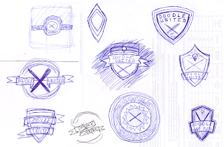
Doodle United Logo
Recently, a group of my classmates from college started a group called Doodle United. It's a community of artists who draw doodles based on a theme. The first theme was a logo for the group. The name "Doodle United" reminded me of some sort of soccer club, so I decided to draw inspiration from logos and crests of the EPL and MLS.
Here are some of my initial sketches:
And these are the final designs:


You can check out our Facebook page here.
Here are some of my initial sketches:

And these are the final designs:
You can check out our Facebook page here.
15.5.11

10.4.11

22.3.11

19.3.11

18.3.11
proof of concept
These images are a sort of proof-of-concept for an idea I've had for awhile now. Stemming from my ongoing pattern studies, I wanted to create designs over physical images. I was also interested in the destruction of one image to create another. So this is the result.
Since this is a proof-of-concept, I'd like some feedback. Which images work best? What type of design (geometric or organic) works better with the photos? Do the images feel cohesive (both the subject matter of the photos, the designs, and the combination of the two)?


Any comments you might have for me as I move forward would be appreciated.
13.3.11

2.3.11

1.3.11


24.2.11

14.2.11


12.2.11

10.2.11
pattern study 016
just need to get away for awhile.
wait.
did i forget my sunglasses?
nope.
wait.
did i forget my sunglasses?
nope.

pattern study 016
ink on paper
8 x 8 in.
7.2.11

3.2.11

1.2.11

27.1.11

25.1.11

18.1.11

Subscribe to:
Posts (Atom)